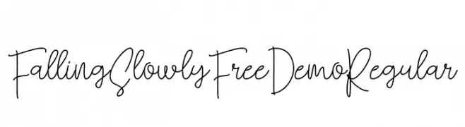
Falling Slowly Free Demo Regular Font
Falling Slowly Free Demo Regular Description
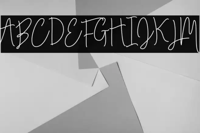
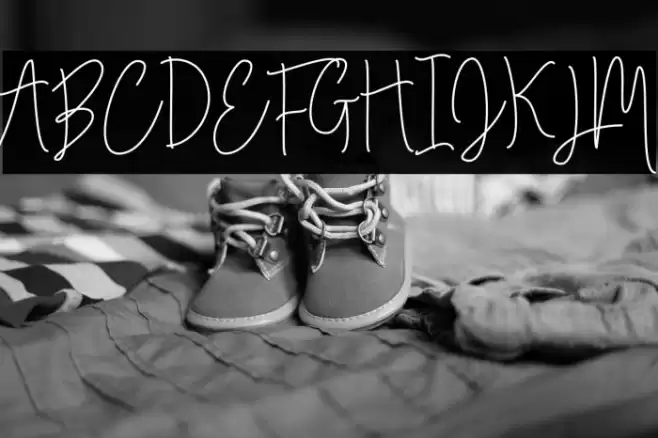
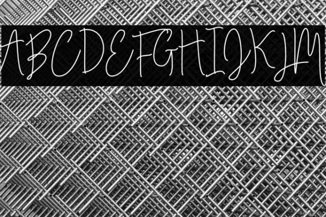
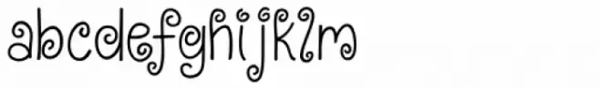
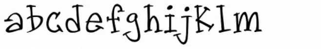
This font features a playful and whimsical handwritten style, characterized by its flowing and interconnected strokes. The uppercase letters are tall and slender, with a slight slant that adds a dynamic feel. The lowercase letters maintain a consistent flow, enhancing the font's casual and approachable appearance. Numbers and special characters are crafted with the same fluidity, ensuring a cohesive look across all text. The overall design exudes a sense of creativity and spontaneity, making it suitable for projects that require a personal touch.
A playful, handwritten font with flowing, interconnected strokes from Uncategorized fonts.
- Downloads: 102
- ( Fonts by QueenType FREE )
- Font: Falling Slowly Free Demo Regular
- Weight:
- Version:
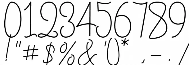
- No. of Characters:: over 20
- Proposed Projects: Ideal for greeting cards, invitations, personal branding, and creative projects that benefit from a personal, handwritten touch.
- Category:
- Bold: No
- Italic: No
- Weight: Regular
- Width: Normal
- Character Spacing: Normal
- Contrast: Low
- Overall Style: Casual, Whimsical
- Use Case: Logos, Invitations, Personal Branding
- Encoding Scheme:
- Is Fixed Pitch: No
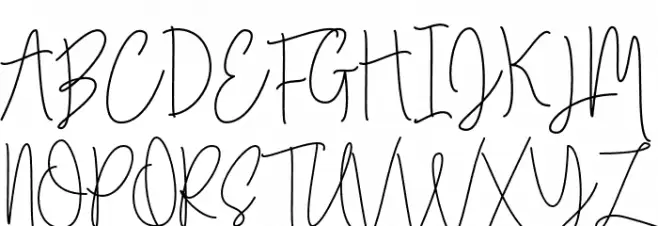
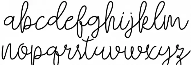
Glyphs
Falling Slowly Free Demo Regular UPPERCASE
Falling Slowly Free Demo Regular LOWERCASE
Falling Slowly Free Demo Regular OTHER CHARS
Gallery Examples
Download
102 Downloads
-
 Buy font KG Falling Slowly Commercial Fonts
 -
 Buy font KG Kiss Me Slowly Commercial Fonts
 -
 Buy font Groovin Up Slowly Commercial Fonts