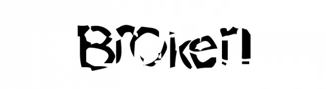
Broken fonts give a clear voice to projects that want distinct personality and practical readability. Use them for headlines, logos, product pages, and web design where the tone must be instant and memorable. This category balances aesthetics with function: strong shapes, considered spacing, and rhythm that holds up on high density screens and print. Keep body text in a neutral companion face and let the category style lead the first impression. Good use cases include brand launches, landing pages, editorial hero sections, packaging, and motion graphics. For best results, set large sizes with generous line spacing and clear contrast. Pair with a restrained color palette and let white space support the typography. Avoid overusing effects; clarity and hierarchy make the design feel intentional and premium. Test at mobile sizes to ensure legibility and adjust tracking if letters feel tight. Combine with supportive icons or imagery, but keep type the main character so the voice stays consistent across channels. Explore related styles for complementary pairings and alternative moods: Capitals, Gothic, Kids, Christmas (Xmas). Mix and match for seasonal campaigns, special editions, or microbrands without losing cohesion.


![Acid Reflux [BRK] Font Preview](https://d144mzi0q5mijx.cloudfront.net/img/A/C/Acid-Reflux-BRK.webp)