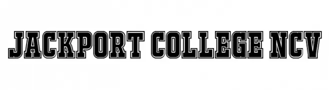
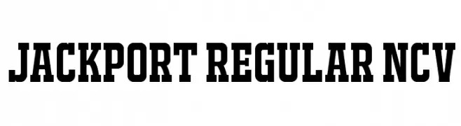
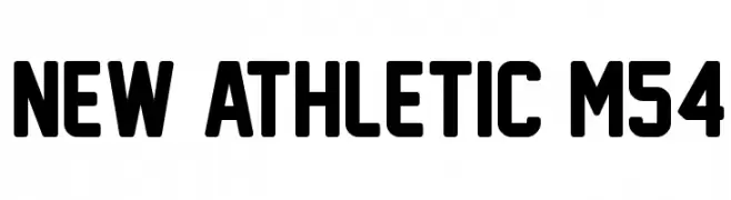
Athletic fonts are bold, dynamic typefaces designed to convey strength, energy, and movement. Often featuring strong lines, angular edges, and condensed or blocky shapes, these fonts are ideal for sports teams, fitness brands, and active lifestyle projects. They instantly create a sense of power and competitiveness, making them perfect for logos, jerseys, posters, banners, and any design that needs to capture a high-energy, performance-driven aesthetic.
In addition to their visual impact, athletic fonts are highly versatile. Many come in multiple weights and styles, allowing designers to pair bold headlines with secondary text that maintains readability while keeping the energetic tone. From vintage varsity lettering to modern geometric sports fonts, these typefaces help brands, teams, and events communicate athleticism, motivation, and team spirit with clarity and style. Explore related styles for complementary pairings and alternative moods: Sports, Sans Serif, Sports, Modern, Thick.
Athletic fonts emphasize performance: clean structure, strong presence, and high legibility.
They fit fitness brands, running events, training programs, and club identities where clarity matters as much as attitude.
Where they work best
Fitness and gym branding, race bibs, sports nutrition packaging, workout plans, team badges, apparel labels, and promotional landing pages.
Recommended pairings
For a modern, readable system: headlines in Athletic + body in Sans Serif.
For extra impact in short titles: combine with Thick.
For a more tech/performance vibe: consider Hi-tech.