Fonts
Fortunis Font
Description
- Font: Fortunis
- Weight: Regular
- Version: Version Version 1.00;July 11, 2023;FontCreator 12.0.0.2555 64-bit
- No. of Characters:: 225
- Encoding Scheme:
- Is Fixed Pitch: 0
Welcome to the Font Trends page — your destination for discovering which fonts are shaping today’s design landscape. Whether you’re working on a brand refresh, social media visuals, or website UI, following current font trends helps your work feel fresh and relevant.
This collection features the most trending fonts of the season, chosen by designers and creators across the world. Expect to see elegant serifs, minimalist sans serifs, expressive display fonts, and handcrafted scripts that define modern aesthetics in 2025.
Combine your favorite trending typefaces with timeless categories like Modern, Serif, or Handwritten for a balanced and eye-catching design.
-
( Fonts by Dieter Steffmann )
A bold, ornate blackletter font with a medieval gothic style.
 Download 531 Downloads@WebFont
 -
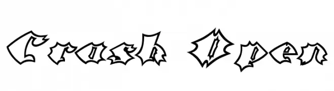
![Crash Open Free Fonts Download]() Download 289 Downloads@WebFont
Download 289 Downloads@WebFont -
![Crash Bold Free Fonts Download]() Download 283 Downloads@WebFont
Download 283 Downloads@WebFont -
![ODINS SPEAR RAGGED HOLLOW Free Fonts Download]() Download 646 Downloads@WebFont
Download 646 Downloads@WebFont -
![ODINS SPEAR Free Fonts Download]() Download 233 Downloads@WebFont
Download 233 Downloads@WebFont -
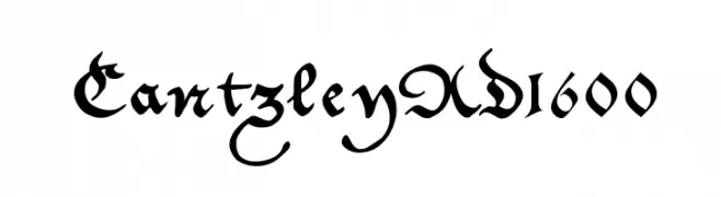
( Fonts by Manfred Klein - manfred-klein.ina-mar.com )
A classic Blackletter font with ornate, angular strokes and high contrast.
![CantzleyAD1600 Free Fonts Download]() Download 573 Downloads@WebFont
Download 573 Downloads@WebFont -
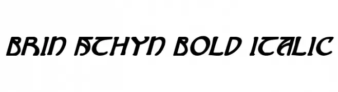
( Fonts by Daniel Zadorozny - www.iconian.com - Free for personal use )
A bold, italic font with dynamic slanted characters and a modern-retro style.
![Brin Athyn Bold Italic Free Fonts Download]() Download 157 Downloads@WebFont
Download 157 Downloads@WebFont -
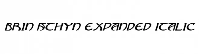
( Fonts by Daniel Zadorozny - www.iconian.com - Free for personal use )
A dynamic, expanded italic font with smooth strokes and moderate contrast.
![Brin Athyn Expanded Italic Free Fonts Download]() Download 137 Downloads@WebFont
Download 137 Downloads@WebFont


FAQ — Font Trends
What are the current font trends?
Simplicity, legibility, and warmth dominate: rounded sans serifs, high-contrast serifs, and tasteful retro revivals are everywhere — clean but human.
Which fonts are trending in design right now?
Popular choices include KoenigsbergerGotisch, Crash Open, Crash Bold, ODINS SPEAR RAGGED HOLLOW and ODINS SPEAR — fonts known for their balance between modern and timeless. They look great on web pages, social content, and packaging, bringing a clean yet expressive feel.
How do I use trending fonts in my projects?
Use one standout display font for titles and pair it with a simple sans serif for body text. This creates contrast without losing readability. Always test how your chosen font trend performs across screen sizes and branding materials before finalizing.
💡 Tip: Refresh key assets every few months with a new trending font to keep visuals sharp and discoverable.