Gravity Sucks Font
Gravity Sucks Description
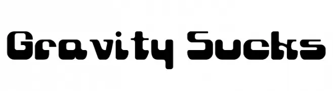
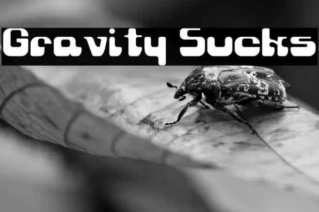
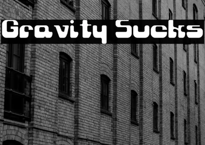
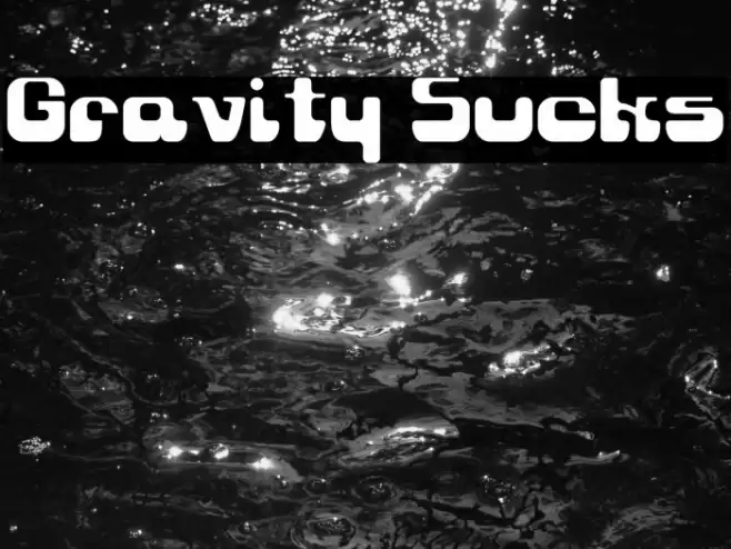
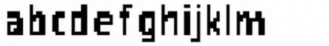
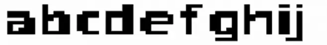
This font features a bold and playful design with rounded edges and a unique, futuristic aesthetic. The characters are wide and have a substantial presence, making them stand out prominently. The uppercase and lowercase letters maintain a consistent style, with a slight variation in the curves and angles that add a dynamic feel. The numbers and special characters are designed to match the overall theme, ensuring uniformity across all elements. This font is ideal for projects that require a modern and eye-catching look, such as branding, posters, and digital media.
A bold, futuristic font with rounded edges and a playful design from Uncategorized fonts.
- Downloads: 562
- ( Fonts by GreyWolf Webworks - www.greywolfwebworks.com - Personal-use only. For commercial use please contact owner. FREE )
- Font: Gravity Sucks
- Weight: Regular
- Version: Version 3.0 - 8/01/99
- No. of Characters:: 172
- Proposed Projects: Ideal for branding, posters, digital media, and any project needing a modern, eye-catching look.
- Category:
- Bold: Yes
- Italic: No
- Weight: Bold
- Width: Expanded
- Character Spacing: Normal
- Contrast: Low
- Overall Style: Modern
- Use Case: Headlines, Logos
- Encoding Scheme:
- Is Fixed Pitch: No
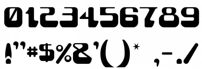
Glyphs ! # $ % ( ) * + , - . / 0 1 2 3 4 5 6 7 8 9 : ; = ? @ A B C D E F G H I J K L M N O P Q R S T U V W X Y Z [ ] ^ _ ` a b c d e f g h i j k l m n o p q r s t u v w x y z { | } ~
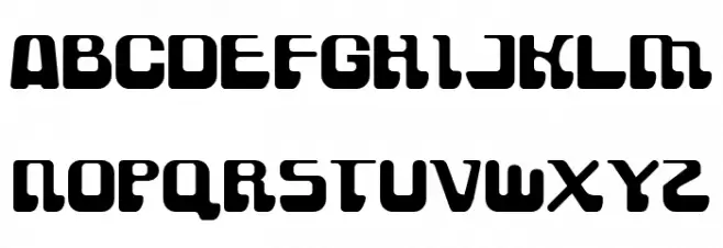
Gravity Sucks UPPERCASE
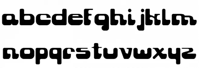
Gravity Sucks LOWERCASE
Gravity Sucks OTHER CHARS
Gallery Examples
-
 Buy font AOL Sucks Regular Commercial Fonts
 -
 Buy font AOL Sucks Thin Commercial Fonts
 -
 Buy font AOL Sucks Wide Commercial Fonts