just that neat Font

just that neat Description
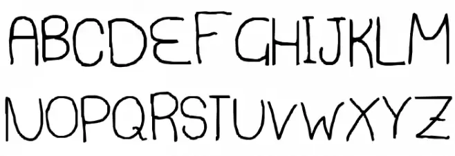
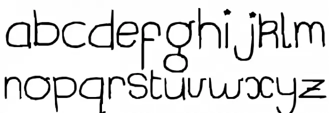
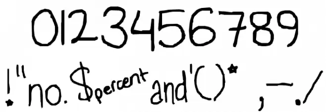
This font exhibits a playful and casual handwritten style, characterized by its uneven strokes and slightly irregular letterforms. The uppercase letters maintain a consistent height, while the lowercase letters show a more varied baseline, adding to the informal aesthetic. The numerals are bold and clear, matching the overall style of the alphabet. Special characters are creatively integrated, maintaining the font's whimsical nature. The strokes are moderately thick, providing good readability while retaining a hand-drawn feel. This font is ideal for projects that require a personal touch, such as greeting cards, children's books, or informal branding.
A playful, handwritten font with uneven strokes and a casual style from Uncategorized fonts.
- Downloads: 284
- just that neat.ttf
- Font: just that neat
- Weight: Regular
- Version: Version Lanier My Font Tool for Tablet PC 1.0
- No. of Characters:: 96
- Proposed Projects: Greeting cards, children's books, informal branding, personal notes.
- Category:
- Bold: No
- Italic: No
- Weight: Regular
- Width: Normal
- Character Spacing: Normal
- Contrast: Low
- Overall Style: Casual, Playful
- Use Case: Headlines, Informal text, Creative projects
- Encoding Scheme:
- Is Fixed Pitch: No
Glyphs ! # $ % ( ) * + , - . / 0 1 2 3 4 5 6 7 8 9 : ; = ? @ A B C D E F G H I J K L M N O P Q R S T U V W X Y Z [ ] ^ _ a b c d e f g h i j k l m n o p q r s t u v w x y z { | } ~
just that neat UPPERCASE
just that neat LOWERCASE
just that neat OTHER CHARS
Gallery Examples


Download Free Fonts
Commercial Fonts Fonts
-
 Buy font Thats Amore Commercial Fonts
 -
 Buy font Thataway JNL Regular Commercial Fonts
 -
 Buy font KG Neatly Printed Commercial Fonts