DearKatieNBP Font

DearKatieNBP Description
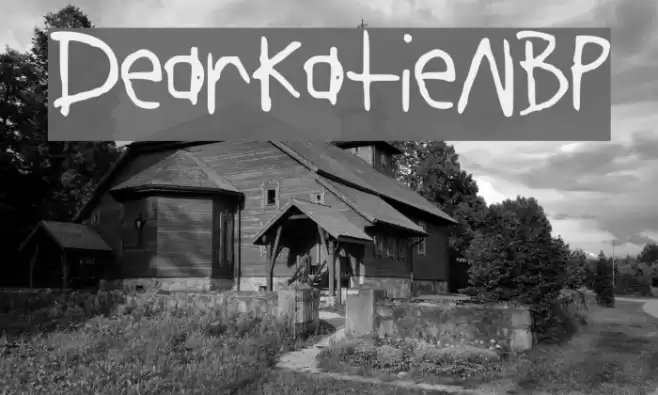
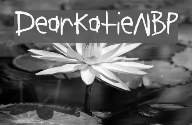
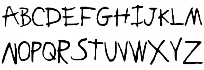
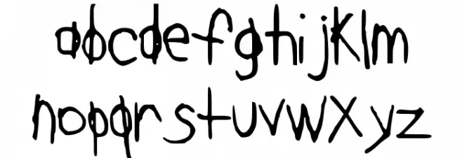
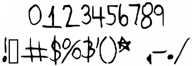
This font features a playful and informal handwritten style, characterized by its uneven strokes and casual appearance. The letters have a slightly irregular baseline, adding to the whimsical and spontaneous feel. The uppercase and lowercase letters maintain a consistent style, with rounded edges and varying stroke widths that give a dynamic and lively impression. The numerals and special characters follow the same informal aesthetic, making the font suitable for creative and fun projects. Its unique charm lies in its ability to convey a sense of personal touch and authenticity.
A playful, handwritten font with uneven strokes and a casual, whimsical style from Uncategorized fonts.
- Downloads: 286
- DearKatieNBP.ttf
- Font: DearKatieNBP
- Weight: Medium
- Version: Version Version 001.000
- No. of Characters:: 143
- Proposed Projects: Ideal for greeting cards, children's books, casual invitations, and playful branding.
- Category:
- Bold: No
- Italic: No
- Weight: Regular
- Width: Normal
- Character Spacing: Normal
- Contrast: Medium
- Overall Style: Playful, Informal
- Use Case: Headlines, Informal text, Creative projects
- Encoding Scheme:
- Is Fixed Pitch: No
Glyphs ! # $ % ( ) * + , - . / 0 1 2 3 4 5 6 7 8 9 : ; = ? @ A B C D E F G H I J K L M N O P Q R S T U V W X Y Z [ ] a b c d e f g h i j k l m n o p q r s t u v w x y z { | } ~
DearKatieNBP UPPERCASE
DearKatieNBP LOWERCASE
DearKatieNBP OTHER CHARS
Gallery Examples