Fonts
Force Majeure Engraved Font
Description
- forcemajeureengrave.ttf
- Font: Force Majeure Engraved
- Weight: Regular
- Version: Version Version 2.0
- No. of Characters:: 221
- Encoding Scheme:
- Is Fixed Pitch: 0
Welcome to the Font Trends page — your destination for discovering which fonts are shaping today’s design landscape. Whether you’re working on a brand refresh, social media visuals, or website UI, following current font trends helps your work feel fresh and relevant.
This collection features the most trending fonts of the season, chosen by designers and creators across the world. Expect to see elegant serifs, minimalist sans serifs, expressive display fonts, and handcrafted scripts that define modern aesthetics in 2025.
Combine your favorite trending typefaces with timeless categories like Modern, Serif, or Handwritten for a balanced and eye-catching design.
-
( Fonts by David Rakowski )
An ornate, decorative font with intricate patterns and a medieval flair.
 Download 322 Downloads
 -
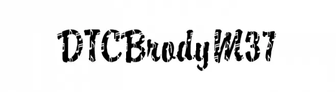
![DTCBrodyM37 Free Fonts Download]() Download 766 Downloads@WebFont
Download 766 Downloads@WebFont -
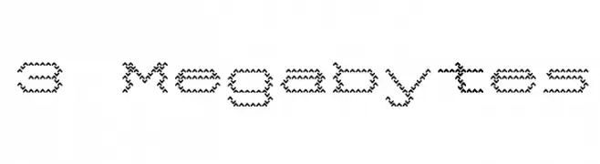
( Fonts by www.stimuleyefonts.com )
A decorative font with a zigzag, stitched appearance.
![3 Megabytes Free Fonts Download]() Download 4706 Downloads@WebFont
Download 4706 Downloads@WebFont -
![bubba Free Fonts Download]() Download 664 Downloads@WebFont
Download 664 Downloads@WebFont -
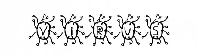
![Virus Free Fonts Download]() Download 734 Downloads@WebFont
Download 734 Downloads@WebFont -
( Fonts by www.aenigmafonts.com )
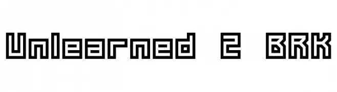
A bold, geometric font with angular, blocky characters and a modern aesthetic.
![Unlearned 2 BRK Free Fonts Download]() Download 393 Downloads@WebFont
Download 393 Downloads@WebFont -
( Fonts by www.aenigmafonts.com )
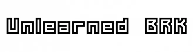
A bold, geometric font with a blocky, outlined design ideal for tech-inspired projects.
![Unlearned BRK Free Fonts Download]() Download 289 Downloads@WebFont
Download 289 Downloads@WebFont -
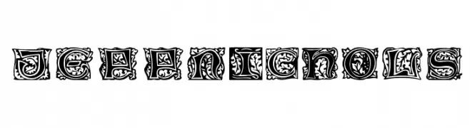
( Fonts by Jeri Ingalls - littlehouse.homestead.com )
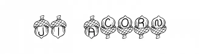
A whimsical, acorn-themed decorative font with uppercase letters.
![JI Acorn Free Fonts Download]() Download 1012 Downloads@WebFont
Download 1012 Downloads@WebFont

FAQ — Font Trends
What are the current font trends?
Simplicity, legibility, and warmth dominate: rounded sans serifs, high-contrast serifs, and tasteful retro revivals are everywhere — clean but human.
Which fonts are trending in design right now?
Popular choices include JeffNichols, DTCBrodyM37, 3 Megabytes, bubba and Virus — fonts known for their balance between modern and timeless. They look great on web pages, social content, and packaging, bringing a clean yet expressive feel.
How do I use trending fonts in my projects?
Use one standout display font for titles and pair it with a simple sans serif for body text. This creates contrast without losing readability. Always test how your chosen font trend performs across screen sizes and branding materials before finalizing.
💡 Tip: Refresh key assets every few months with a new trending font to keep visuals sharp and discoverable.