KanoteDemo Font
✎ Cartoon
📄 TrueType
🔢 78 chars
⬇ 436
✅ Free
✅ Web Font

KanoteDemo Description
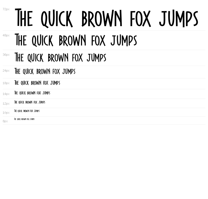
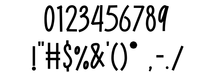
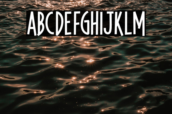
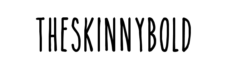
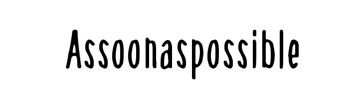
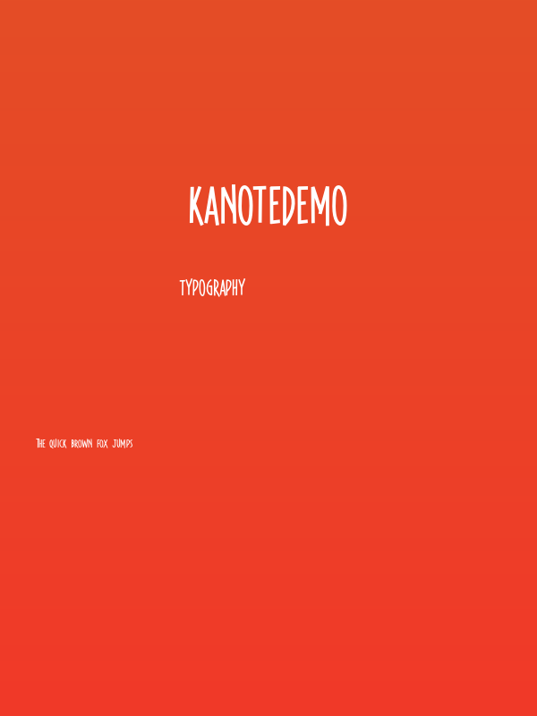
This font features a playful and informal style, characterized by its tall, narrow letterforms and slightly irregular strokes. The uppercase letters are bold and prominent, while the lowercase letters maintain a consistent height, adding to the font's casual appeal. The numbers are clear and easy to read, with a slight slant that adds to the dynamic feel. Special characters are well-integrated, maintaining the overall aesthetic. The font's unique personality makes it suitable for projects that require a touch of whimsy and creativity.
Fonts by Letterhend Studio
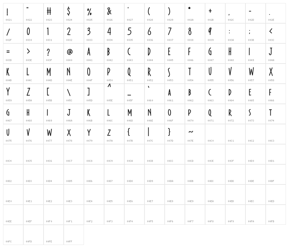
This font includes 78 characters. Click on any character to see details.
Numbers & Symbols
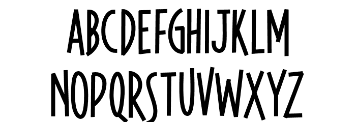
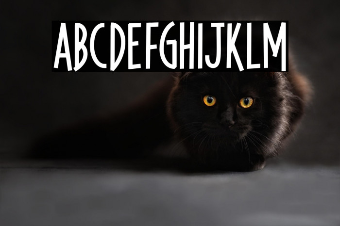
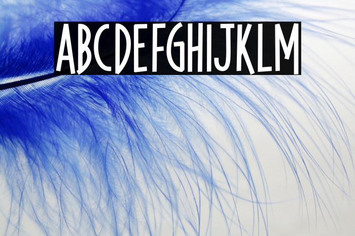
KANOTEDEMO UPPERCASE
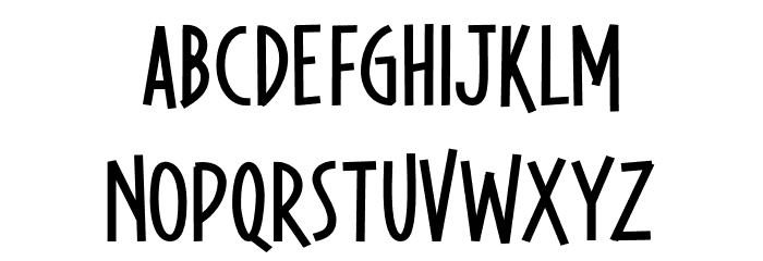
KANOTEDEMO LOWERCASE
KANOTEDEMO OTHER CHARS
GALLERY EXAMPLES
Similar Free Fonts
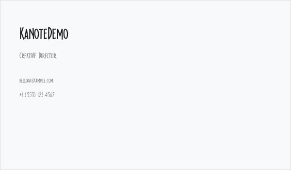
Business Card
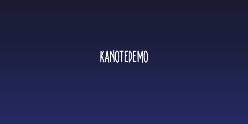
Social Header
Logo
Poster
Information
| Name | KanoteDemo |
| Font Family | Kanote Demo |
| Style | Regular |
| Format | TrueType (.ttf) |
| File | KanoteDemo.zip |
| Version | Version 1.000 |
| No. of Characters: | 78 |
| Downloads | 436 |
| Added | 2022-12-07 |
| Updated | 2024-11-25 |
| Categories | Cartoon |
| Bold | Yes |
| Italic | No |
| Width | Condensed |
| Character Spacing | Monospaced |
| Contrast | Medium |
| Overall Style | Playful, Informal |
| Use Case | Headlines, Logos, Posters |
| Proposed Projects | Ideal for children's books, playful branding, greeting cards, and creative posters. |
| Is Fixed Pitch | No |
| Web Font | Available |
| License | Free for personal use |
Fonts by Letterhend Studio
Tags
💻 Windows
- Extract ZIP
- Right-click .ttf -> Install
🍎 macOS
- Extract ZIP
- Double-click .ttf -> Install Font
KanoteDemo
Free · TrueType
| Name | KanoteDemo |
| Type | TrueType |
| Characters | 78 |
| Downloads | 436 |
| Added | 2022-12-07 |
| Web Font | Available |
| Author | Fonts by Letterhend Studio |
| Categories | Cartoon |