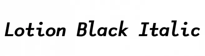
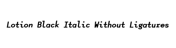
Lotion Black Italic Font
✎ Thick
📄 TrueType
🔢 169 chars
⬇ 2,751
✅ Free
✅ Web Font
Lotion Black Italic Description
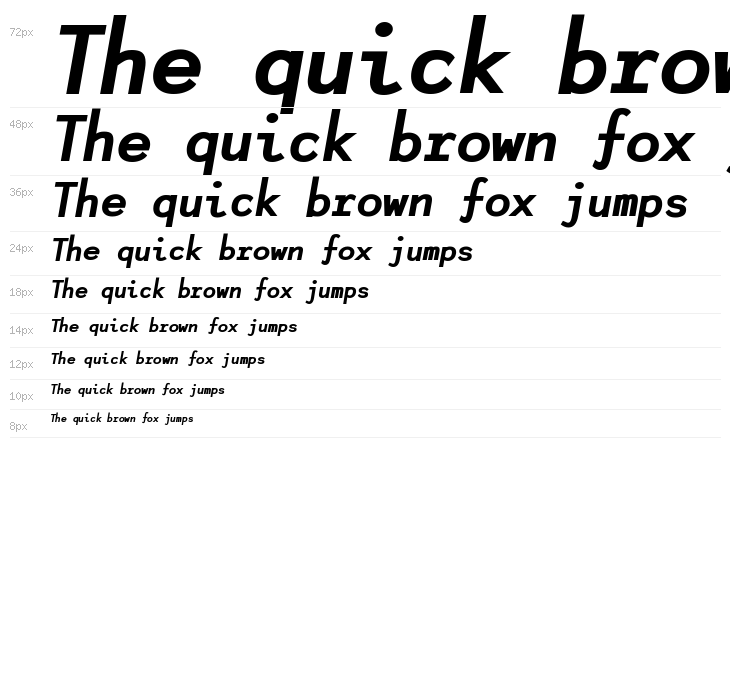
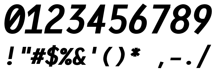
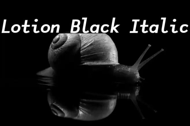
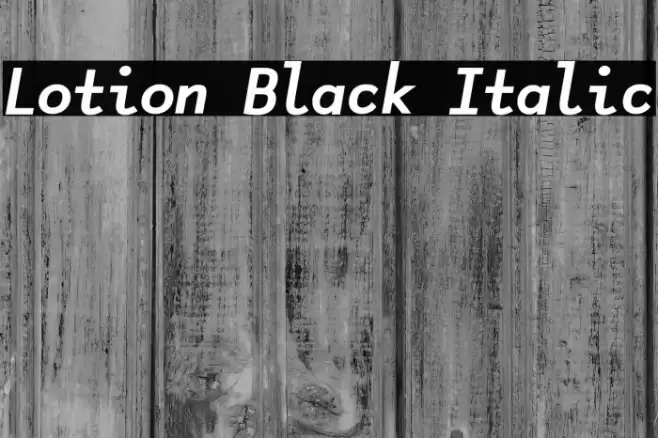
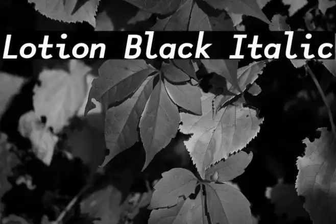
This font features a bold and italicized style, combining strong, thick strokes with a forward slant that gives it a dynamic and assertive appearance. The uppercase letters are robust and commanding, while the lowercase letters maintain a consistent weight, enhancing readability. Numbers and special characters are designed with the same boldness, ensuring uniformity across all glyphs. The overall design is modern and impactful, suitable for making statements in any text. The italic slant adds a sense of movement and urgency, making it ideal for attention-grabbing headlines or titles.
Fonts by Nina

This font includes 169 characters. Click on any character to see details.
Numbers & Symbols
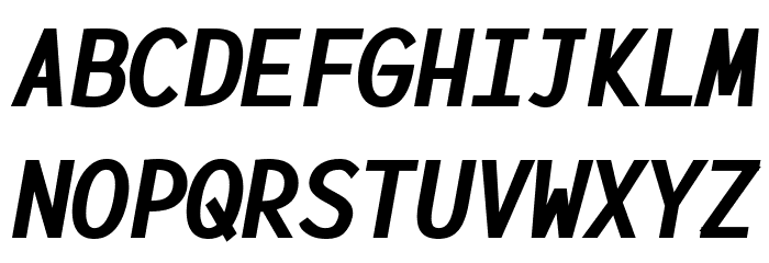
LOTION-BLACK-ITALIC UPPERCASE
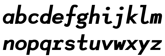
LOTION-BLACK-ITALIC LOWERCASE
LOTION-BLACK-ITALIC OTHER CHARS
GALLERY EXAMPLES
Similar Free Fonts

Business Card

Social Header

Logo
Poster

Information
| Name | Lotion Black Italic |
| Font Family | Lotion Black |
| Style | Lotion-BlackItalic |
| Format | TrueType (.ttf) |
| File | Lotion-Black-Italic.zip |
| Weight | Italic |
| Version | Version Version 1.006 |
| No. of Characters: | 169 |
| Downloads | 2,751 |
| Added | 2024-05-14 |
| Updated | 2024-11-21 |
| Categories | Thick |
| Bold | Yes |
| Italic | Yes |
| Width | Normal |
| Character Spacing | Monospaced |
| Contrast | Low |
| Overall Style | Modern |
| Use Case | Headlines, Logos |
| Proposed Projects | Ideal for branding, advertising, headlines, and poster design. |
| Is Fixed Pitch | No |
| Web Font | Available |
| License | Free for personal use |
Fonts by Nina
💻 Windows
- Extract ZIP
- Right-click .ttf -> Install
🍎 macOS
- Extract ZIP
- Double-click .ttf -> Install Font
Lotion Black Italic
Free · TrueType
| Name | Lotion Black Italic |
| Type | TrueType |
| Characters | 169 |
| Downloads | 2,751 |
| Added | 2024-05-14 |
| Web Font | Available |
| Author | Fonts by Nina |
| Categories | Thick |