Hurtz Font
✎ Cartoon
📄 TrueType
🔢 131 chars
⬇ 529
✅ Free
✅ Web Font

Hurtz Description
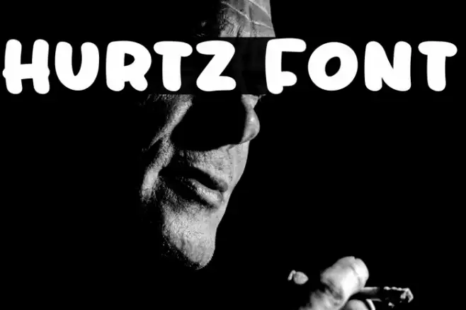
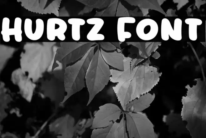
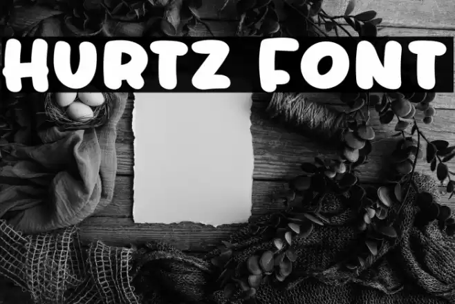
This font features bold, rounded characters with a playful and informal style. The letters are thick and have a consistent weight throughout, giving them a strong presence. The rounded edges and bubbly appearance contribute to a friendly and approachable look. The characters are evenly spaced, ensuring readability while maintaining a cohesive visual flow. The font includes both uppercase and lowercase letters, numerals, and a variety of special characters, making it versatile for different design needs. Its unique style makes it suitable for projects that require a touch of whimsy and fun.
Fonts by Stefie Justprince
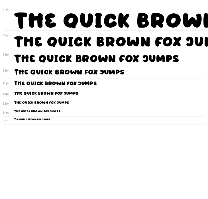

This font includes 131 characters. Click on any character to see details.
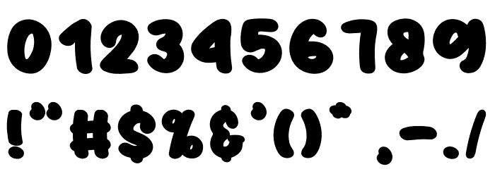
Numbers & Symbols
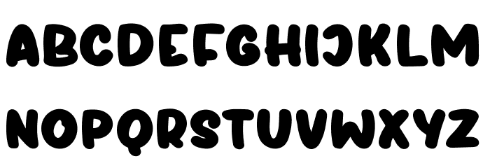
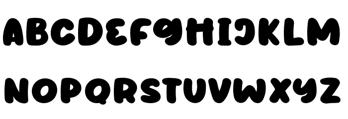
HURTZ UPPERCASE
HURTZ LOWERCASE
HURTZ OTHER CHARS
GALLERY EXAMPLES
No similar fonts data yet.
Business Card

Social Header

Logo
Poster

Information
| Name | Hurtz |
| Font Family | Hurtz |
| Style | Hurtz |
| Format | TrueType (.ttf) |
| File | Hurtz.zip |
| Weight | Regular |
| Version | Version Version 1.000 |
| No. of Characters: | 131 |
| Downloads | 529 |
| Added | 2022-07-05 |
| Updated | 2024-11-25 |
| Categories | Cartoon |
| Bold | Yes |
| Italic | No |
| Width | Normal |
| Character Spacing | Monospaced |
| Contrast | Low |
| Overall Style | Playful |
| Use Case | Headlines, Logos, Posters |
| Proposed Projects | Ideal for children's books, playful branding, posters, and social media graphics. |
| Is Fixed Pitch | No |
| Web Font | Available |
| License | Free for personal use |
Fonts by Stefie Justprince
Tags
💻 Windows
- Extract ZIP
- Right-click .ttf -> Install
🍎 macOS
- Extract ZIP
- Double-click .ttf -> Install Font
Hurtz
Free · TrueType
| Name | Hurtz |
| Type | TrueType |
| Characters | 131 |
| Downloads | 529 |
| Added | 2022-07-05 |
| Web Font | Available |
| Author | Fonts by Stefie Justprince |
| Categories | Cartoon |