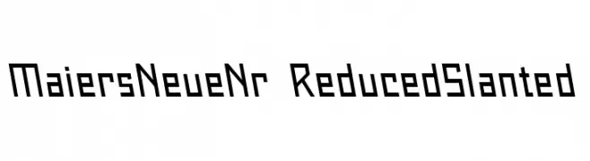
Maiers Neue Nr.8 Reduced Slanted Font
Maiers Neue Nr.8 Reduced Slanted Description
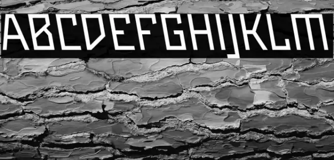
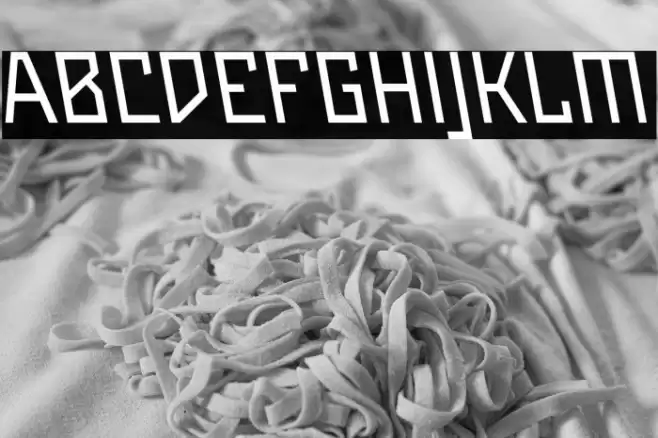
This font features a geometric and angular design with a distinctly modern and futuristic feel. The characters are constructed with straight lines and sharp angles, giving them a technical and precise appearance. The uppercase letters are bold and prominent, while the lowercase letters maintain a consistent style with slightly reduced height. The font's slanted orientation adds a dynamic and forward-moving energy, making it suitable for contemporary and innovative design projects. The uniform stroke width across all characters provides a clean and cohesive look, enhancing readability while maintaining a unique aesthetic.
A geometric, angular font with a modern, slanted design from Uncategorized fonts.
- Downloads: 51
- ( Fonts by ingoFonts - Ingo Zimmermann - Personal-use only. For commercial use please contact owner. FREE )
- Font: Maiers Neue Nr.8 Reduced Slanted
- Weight:
- Version:
- No. of Characters:: over 20
- Proposed Projects: Ideal for tech branding, futuristic posters, and innovative product packaging.
- Category:
- Bold: Yes
- Italic: No
- Weight: Bold
- Width: Normal
- Character Spacing: Normal
- Contrast: Low
- Overall Style: Modern
- Use Case: Headlines, Logos
- Encoding Scheme:
- Is Fixed Pitch: No
Glyphs
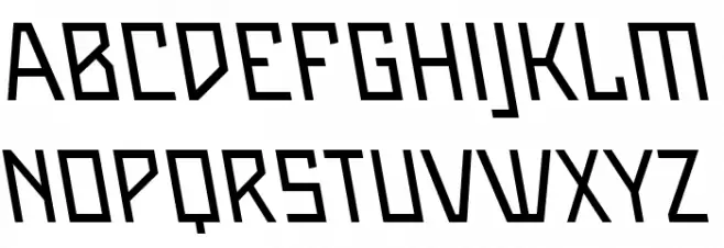
Maiers Neue Nr.8 Reduced Slanted UPPERCASE
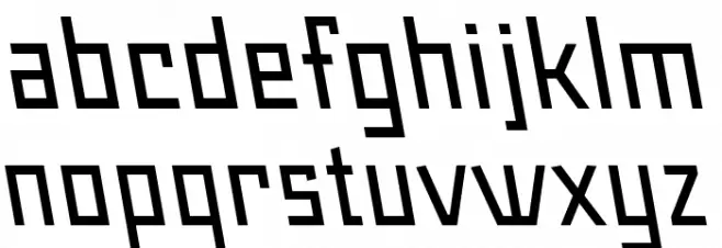
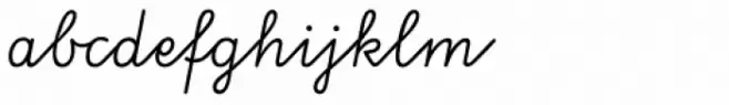
Maiers Neue Nr.8 Reduced Slanted LOWERCASE
Maiers Neue Nr.8 Reduced Slanted OTHER CHARS

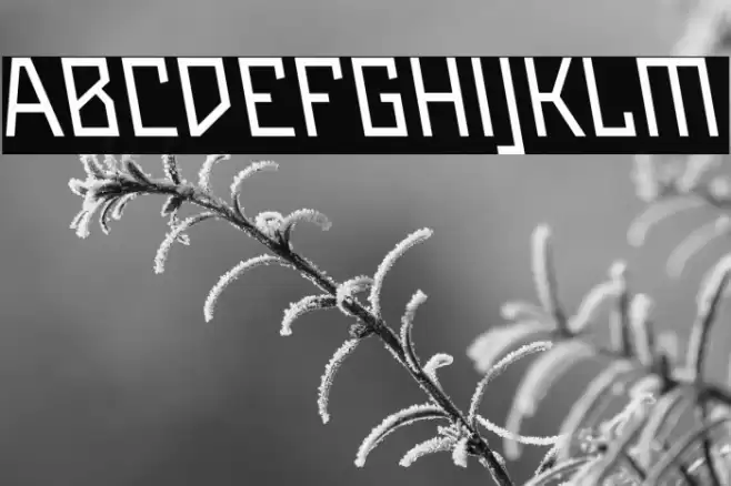
Gallery Examples
Download
51 Downloads
-
 Buy font Gotyk Nr7 Commercial Fonts
 -
 Buy font Ruff NReady Commercial Fonts
 -
 Buy font VA Script Nr1 SB Regular Commercial Fonts