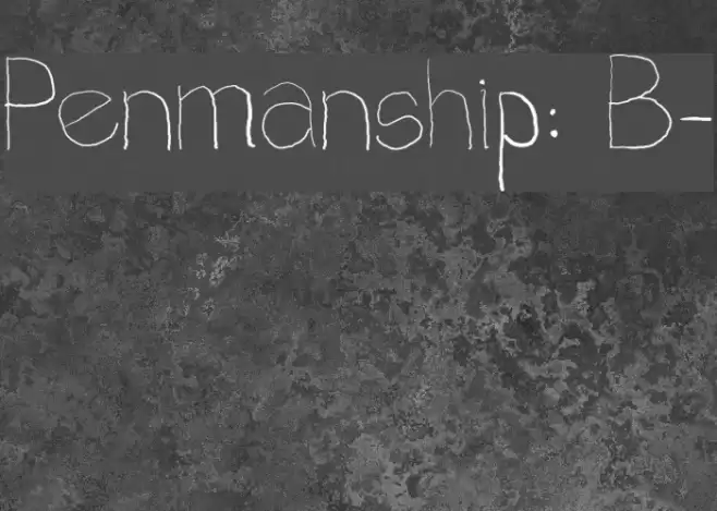
Penmanship: B- Font
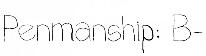
Penmanship: B- Description
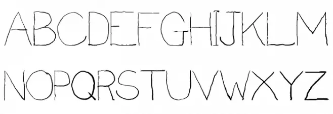
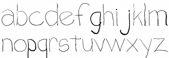
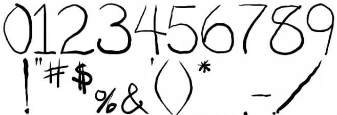
This font exhibits a unique, handwritten style that mimics the fluidity and irregularities of natural penmanship. The characters are slightly uneven, with varying stroke thicknesses that give it an organic and personal feel. The uppercase letters are tall and slender, while the lowercase letters maintain a consistent flow, enhancing the handwritten aesthetic. Numbers and special characters follow the same style, contributing to a cohesive look. This font's charm lies in its imperfections, making it ideal for projects that require a personal touch.
A handwritten-style font with organic, fluid strokes and a personal touch from Typewriter fonts.
- Downloads: 575
- bminus.ttf
- Font: Penmanship: B-
- Weight: Regular
- Version: Version 1.2
- No. of Characters:: 102
- Proposed Projects: Ideal for greeting cards, personal letters, invitations, and creative projects that require a handwritten feel.
- Category:
- Bold: No
- Italic: No
- Weight: Regular
- Width: Normal
- Character Spacing: Normal
- Contrast: Medium
- Overall Style: Decorative
- Use Case: Logos, Invitations, Greeting Cards
- Encoding Scheme:
- Is Fixed Pitch: No
Glyphs ! # $ % ( ) * + , - . / 0 1 2 3 4 5 6 7 8 9 : ; ? @ A B C D E F G H I J K L M N O P Q R S T U V W X Y Z [ ] a b c d
Penmanship: B- UPPERCASE
Penmanship: B- LOWERCASE
Penmanship: B- OTHER CHARS
Gallery Examples