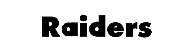
Raiders Font
Raiders Description
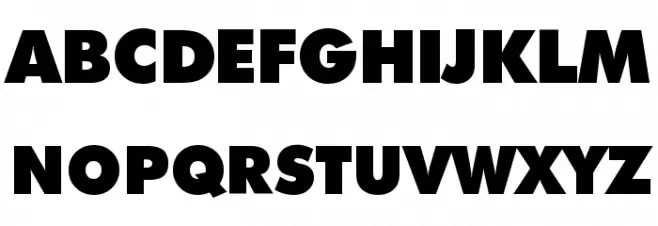
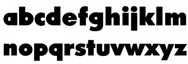
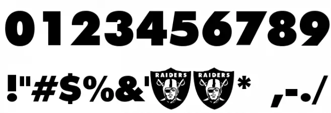
This font features bold, geometric letterforms with a strong presence. The uppercase and lowercase letters are uniformly thick, creating a sense of stability and confidence. The numbers are equally bold, maintaining the font's overall robust appearance. Special characters are designed to match the weight and style of the alphabet, ensuring consistency throughout. The font's boldness makes it ideal for attention-grabbing headlines and impactful designs. Its clean lines and lack of serifs contribute to a modern aesthetic, while the uniformity in stroke width provides a cohesive look across all characters.
A bold, geometric font with a strong, modern presence from Formal fonts.
- Downloads: 8,569
- ( Fonts by Dennis Ludlow - Sharkshock FREE )
- Raiders.ttf
- Font: Raiders
- Weight: Regular
- Version: Version visit www.sharkshock.com
- No. of Characters:: 98
- Proposed Projects: Ideal for sports branding, posters, headlines, and logos that require a bold statement.
- Category:
- Bold: Yes
- Italic: No
- Weight: Bold
- Width: Normal
- Character Spacing: Normal
- Contrast: Low
- Overall Style: Modern
- Use Case: Headlines, Logos
- Encoding Scheme:
- Is Fixed Pitch: No
Glyphs ! # $ % ( ) * + , - . / 0 1 2 3 4 5 6 7 8 9 : ; = ? @ A B C D E F G H I J K L M N O P Q R S T U V W X Y Z [ ] ^ _ ` a b c d e f g h i j k l m n o p q r s t u v w x y z { | } ~
Raiders UPPERCASE
Raiders LOWERCASE
Raiders OTHER CHARS
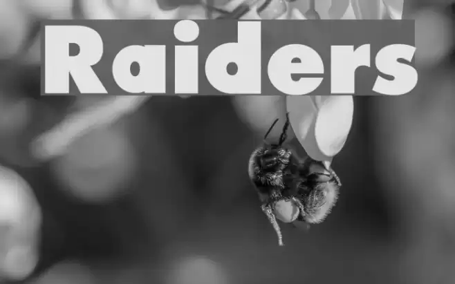
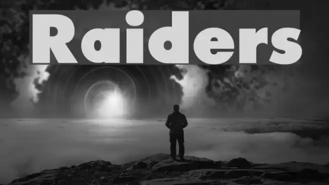
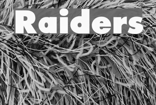
Gallery Examples