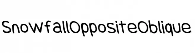
Snowfall Opposite Oblique Font
Snowfall Opposite Oblique Description
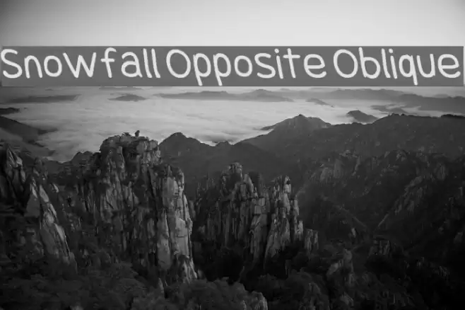
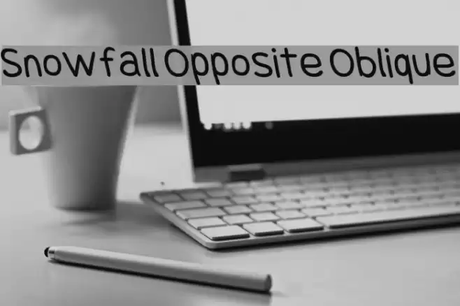
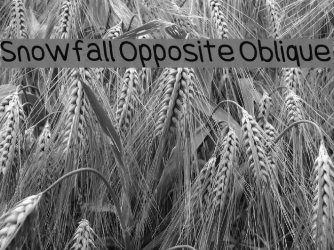
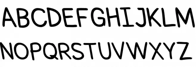
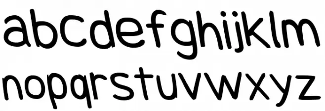
This playful and informal font features a handwritten style with a slight slant, giving it a casual and friendly appearance. The characters are rounded and smooth, with consistent stroke widths that maintain a uniform look throughout. The uppercase and lowercase letters are well-balanced, and the numerals are clear and easy to read. Special characters are included, adding versatility for various uses. The overall design is approachable and modern, making it suitable for projects that require a personal touch.
A playful, handwritten-style font with a casual and friendly appearance from Uncategorized fonts.
- Downloads: 246
- SnowfallOpObl.otf
- Font: Snowfall Opposite Oblique
- Weight: Rev
- Version: Version 0.9
- No. of Characters:: 107
- Proposed Projects: Ideal for children's books, greeting cards, informal invitations, and creative branding projects.
- Category:
- Bold: No
- Italic: Yes
- Weight: Regular
- Width: Normal
- Character Spacing: Normal
- Contrast: Low
- Overall Style: Casual
- Use Case: Headlines, Informal text, Creative projects
- Encoding Scheme:
- Is Fixed Pitch: No
Glyphs ! # $ % ( ) * + , - . / 0 1 2 3 4 5 6 7 8 9 : ; = ? @ A B C D E F G H I J K L M N O P Q R S T U V W X Y Z [ ] ^ _ ` a b c d e f g h i j k l m n o p q r s t u v w x y z { | } ~
Snowfall Opposite Oblique UPPERCASE
Snowfall Opposite Oblique LOWERCASE
Snowfall Opposite Oblique OTHER CHARS

Gallery Examples