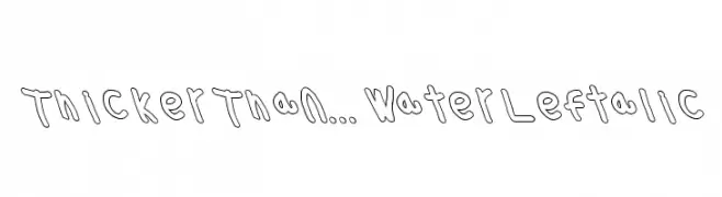
Thicker Than... Water Leftalic Font
Thicker Than... Water Leftalic Description
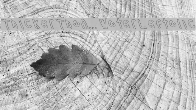
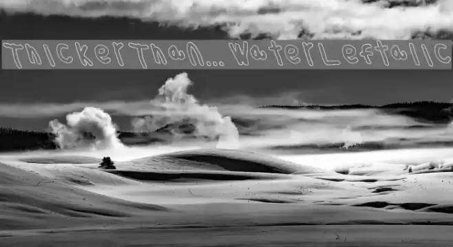
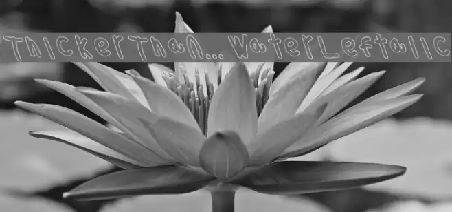
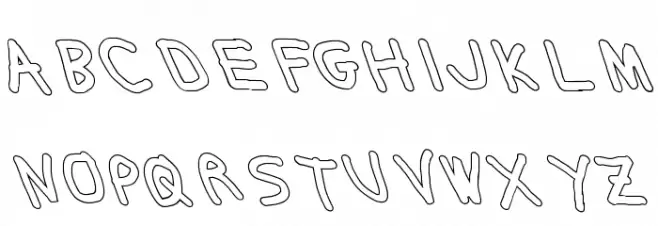
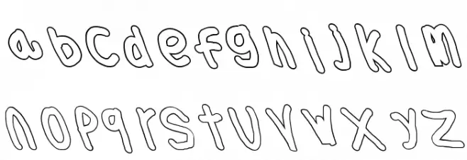
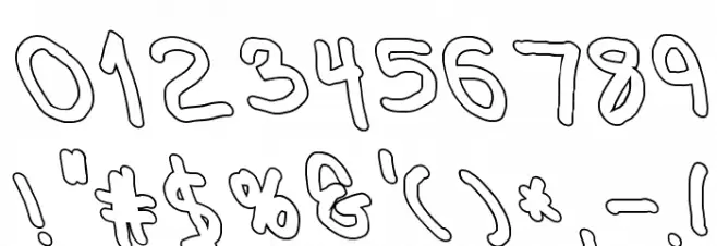
This playful and bold font features a hand-drawn aesthetic with thick, uneven strokes that give it a whimsical and informal appearance. The characters are slightly slanted, adding a dynamic and lively feel. The uppercase and lowercase letters maintain a consistent style, with rounded edges and a casual, friendly vibe. Numbers and special characters are designed with the same playful touch, making them suitable for creative projects. The font's unique style makes it stand out, perfect for designs that require a personal and approachable look.
A playful, hand-drawn font with thick, uneven strokes and a whimsical style from Handwritten fonts.
- Downloads: 105
- ( Fonts by Cannot Into Space Fonts FREE )
- ThickerThanOlLeftalic.otf
- Font: Thicker Than... Water Leftalic
- Weight: Medium
- Version: Version 1.098
- No. of Characters:: 120
- Proposed Projects: Ideal for children's books, playful branding, casual invitations, and creative posters.
- Category:
- Bold: Yes
- Italic: Yes
- Weight: Bold
- Width: Normal
- Character Spacing: Normal
- Contrast: Low
- Overall Style: Decorative
- Use Case: Headlines, Logos, Posters
- Encoding Scheme:
- Is Fixed Pitch: No
Glyphs ! # $ % ( ) * + , - . / 0 1 2 3 4 5 6 7 8 9 : ; = ? @ A B C D E F G H I J K L M N O P Q R S T U V W X Y Z [ ] ^ _ ` a b c d e f g h i j k l m n o p q r s t u v w x y z { | } ~
Thicker Than... Water Leftalic UPPERCASE
Thicker Than... Water Leftalic LOWERCASE
Thicker Than... Water Leftalic OTHER CHARS
Gallery Examples