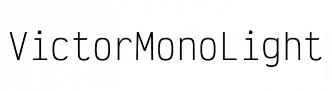
Victor Mono Light Font
✎ Sans Serif
📄 TrueType
🔢 708 chars
⬇ 257
✅ Free
✅ Web Font
Victor Mono Light Description
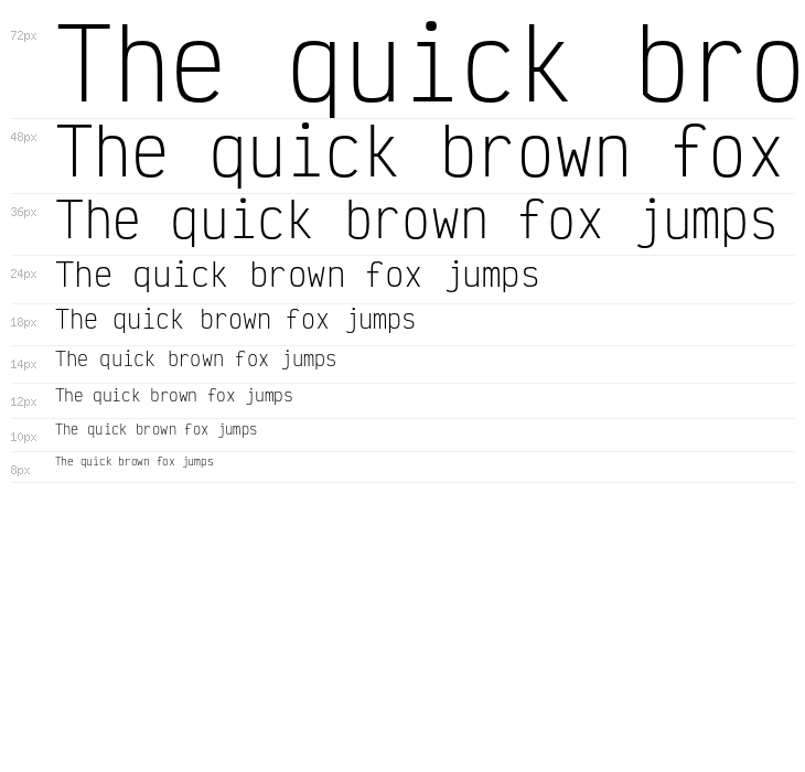
This font features a clean and modern monospaced design, characterized by its uniform width for each character. The letters are sleek and slightly elongated, providing a contemporary and minimalist aesthetic. The strokes are consistent in thickness, offering a low contrast that enhances readability and clarity. Its geometric shapes and open counters contribute to a sense of balance and precision, making it ideal for coding and technical documents. The font maintains a professional appearance while being approachable and easy on the eyes.
Fonts by Rune Bjørnerås

This font includes 708 characters. Click on any character to see details.
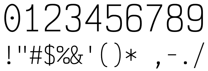
Numbers & Symbols
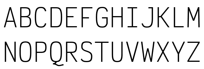
VICTOR-MONO-LIGHT UPPERCASE
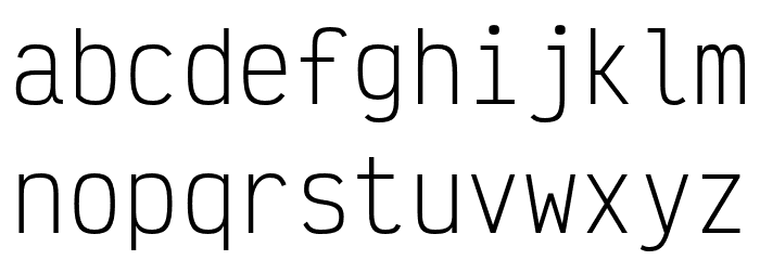
VICTOR-MONO-LIGHT LOWERCASE
VICTOR-MONO-LIGHT OTHER CHARS
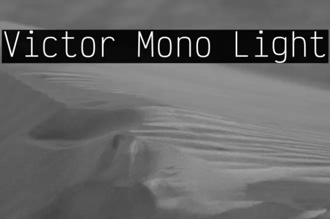
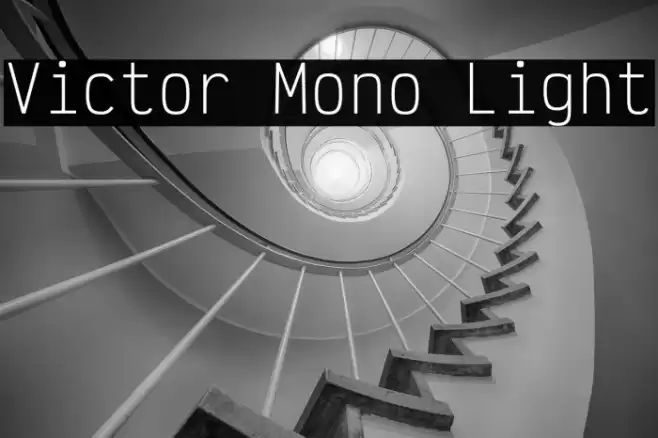
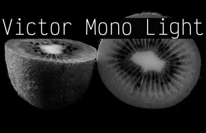
GALLERY EXAMPLES
No similar fonts data yet.
Business Card

Social Header

Logo
Poster

Information
| Name | Victor Mono Light |
| Font Family | Victor Mono Light |
| Style | Regular |
| Format | TrueType (.ttf) |
| File | Victor-Mono-Light.zip |
| Weight | SemiBold Italic |
| Version | Version 1.260;hotconv 1.0.109;makeotfexe 2.5.65596 |
| No. of Characters: | 708 |
| Downloads | 257 |
| Added | 2022-08-11 |
| Updated | 2024-11-25 |
| Categories | Sans Serif |
| Bold | No |
| Italic | No |
| Width | Normal |
| Character Spacing | Monospaced |
| Contrast | Low |
| Overall Style | Modern |
| Use Case | Coding, Technical documents, Digital interfaces |
| Proposed Projects | Ideal for coding environments, technical documentation, and digital interfaces where clarity and precision are paramount. |
| Is Fixed Pitch | No |
| Web Font | Available |
| License | Free for personal use |
Fonts by Rune Bjørnerås
Tags
💻 Windows
- Extract ZIP
- Right-click .ttf -> Install
🍎 macOS
- Extract ZIP
- Double-click .ttf -> Install Font
Victor Mono Light
Free · TrueType
| Name | Victor Mono Light |
| Type | TrueType |
| Characters | 708 |
| Downloads | 257 |
| Added | 2022-08-11 |
| Web Font | Available |
| Author | Fonts by Rune Bjørnerås |
| Categories | Sans Serif |