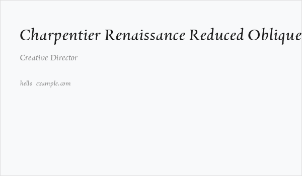
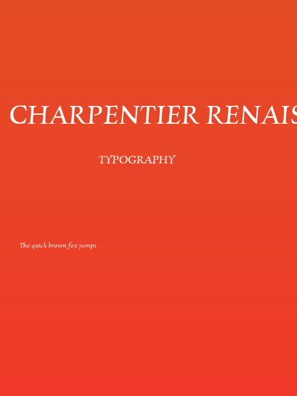
Charpentier Renaissance Reduced Oblique Font
✎ Calligraphic
📄 TrueType
🔢 50 chars
⬇ 53
✅ Free
✅ Web Font

Charpentier Renaissance Reduced Oblique Description
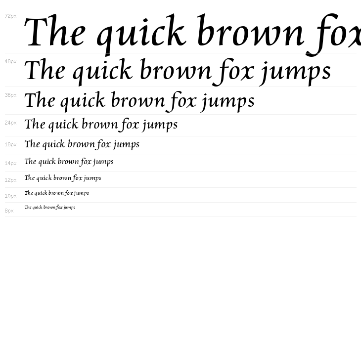
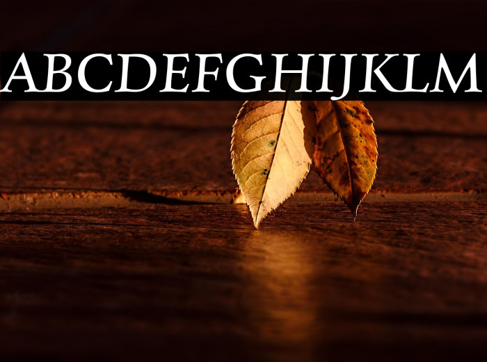
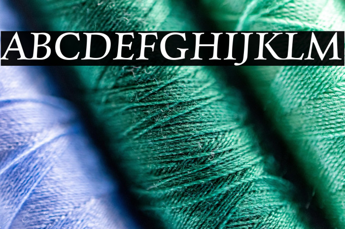
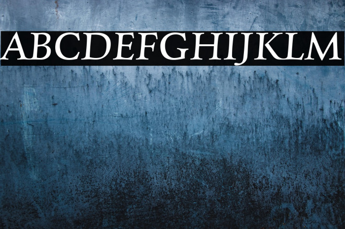
This font exudes a classic and elegant feel, reminiscent of Renaissance calligraphy. The characters are slightly oblique, giving them a dynamic and flowing appearance. The serifs are pronounced yet refined, adding a touch of sophistication. The uppercase letters are stately and well-proportioned, while the lowercase letters maintain a graceful continuity. The overall design is balanced, with moderate contrast between thick and thin strokes, enhancing readability while maintaining an artistic flair. This font is ideal for projects that require a historical or formal touch, such as invitations, certificates, or editorial design.
Fonts by ingoFonts - Ingo Zimmermann - Personal-use only. For commercial use please contact owner.
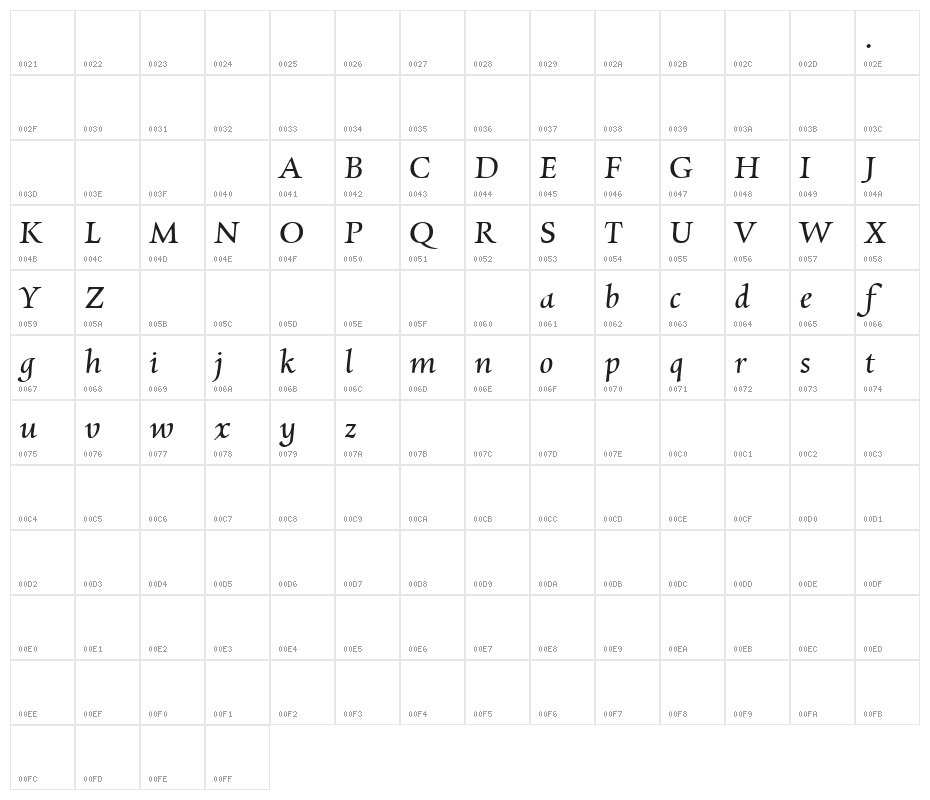
This font includes 50 characters. Click on any character to see details.
Numbers & Symbols
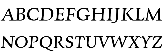
CHARPENTIER-RENAISSANCE-REDUCED-OBLIQUE1 UPPERCASE
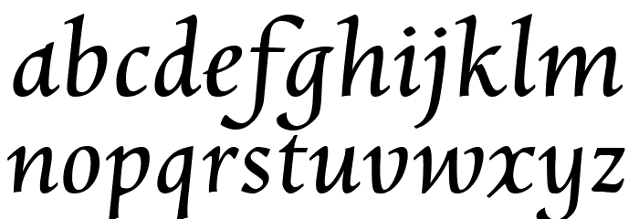
CHARPENTIER-RENAISSANCE-REDUCED-OBLIQUE1 LOWERCASE
CHARPENTIER-RENAISSANCE-REDUCED-OBLIQUE1 OTHER CHARS

GALLERY EXAMPLES
No similar fonts data yet.
Business Card
Social Header

Logo
Poster
Information
| Name | Charpentier Renaissance Reduced Oblique |
| Format | TrueType (.ttf) |
| File | Charpentier-Renaissance-Reduced-Oblique1.zip |
| No. of Characters: | 50 |
| Downloads | 53 |
| Added | 2023-06-06 |
| Updated | 2024-11-21 |
| Categories | Calligraphic |
| Bold | No |
| Italic | Yes |
| Width | Normal |
| Character Spacing | Monospaced |
| Contrast | Medium |
| Overall Style | Classic |
| Use Case | Headlines, Body text, Logos |
| Proposed Projects | Ideal for wedding invitations, historical documents, formal certificates, and editorial layouts. |
| Is Fixed Pitch | No |
| Web Font | Available |
| License | Free for personal use |
Fonts by ingoFonts - Ingo Zimmermann - Personal-use only. For commercial use please contact owner.
Tags
💻 Windows
- Extract ZIP
- Right-click .ttf -> Install
🍎 macOS
- Extract ZIP
- Double-click .ttf -> Install Font
Charpentier Renaissance Reduced Oblique
Free · TrueType
| Name | Charpentier Renaissance Reduced Oblique |
| Type | TrueType |
| Characters | 50 |
| Downloads | 53 |
| Added | 2023-06-06 |
| Web Font | Available |
| Author | Fonts by ingoFonts - Ingo Zimmermann - Personal-use only. For commercial use please contact owner. |
| Categories | Calligraphic |